Since writing this article, Facebook made a few changes. You may read about them here.
Recently an affiliate asked me to assist her with setting up a Facebook business page. I advised her to take a look at one of our Facebook page to see how ‘things were done‘. As we were reviewing our page, I noticed that we were not following best practices.
Facebook Image Best Practices
- Keep the image simple, with a clear focal point.

PACE Express
This image gives all the pertinent information about our PACE Express program, but it is a little busy. Facebook cover photos should include a single subject as the focal point. Keep your image simple with a solid background and your Call To Action (CTA) in the middle or right side of the cover photo. Try to keep the image at or under the 20% text mark (20% text, 80% image). Although Facebook removed any reference to the 20% rule on text in cover photos … that doesn’t mean you should crowd your cover photo with text. The previous rule said that only 20% of your cover photo could be text.
- Do not hide content behind your profile picture.

Don’t have content on your cover photo that will be hidden by the profile image.
In the example above, part of our message is covered by the profile picture. Visitors will not see the entire message unless the click on the image. Your entire message should be immediately viewable to your Facebook Fans.
According to Facebook’s Help page, on desktop computers, the profile picture is located 16 pixels from the left edge of the cover photo, and 176 pixels from the top of the cover photo.
- Obeying Facebook guidelines is crucial to your Facebook Page existing in the first place. Covers can’t be deceptive, misleading, or infringe on anyone else’s copyright. You may not encourage people to upload your cover to their personal timelines.

Your cover is public.
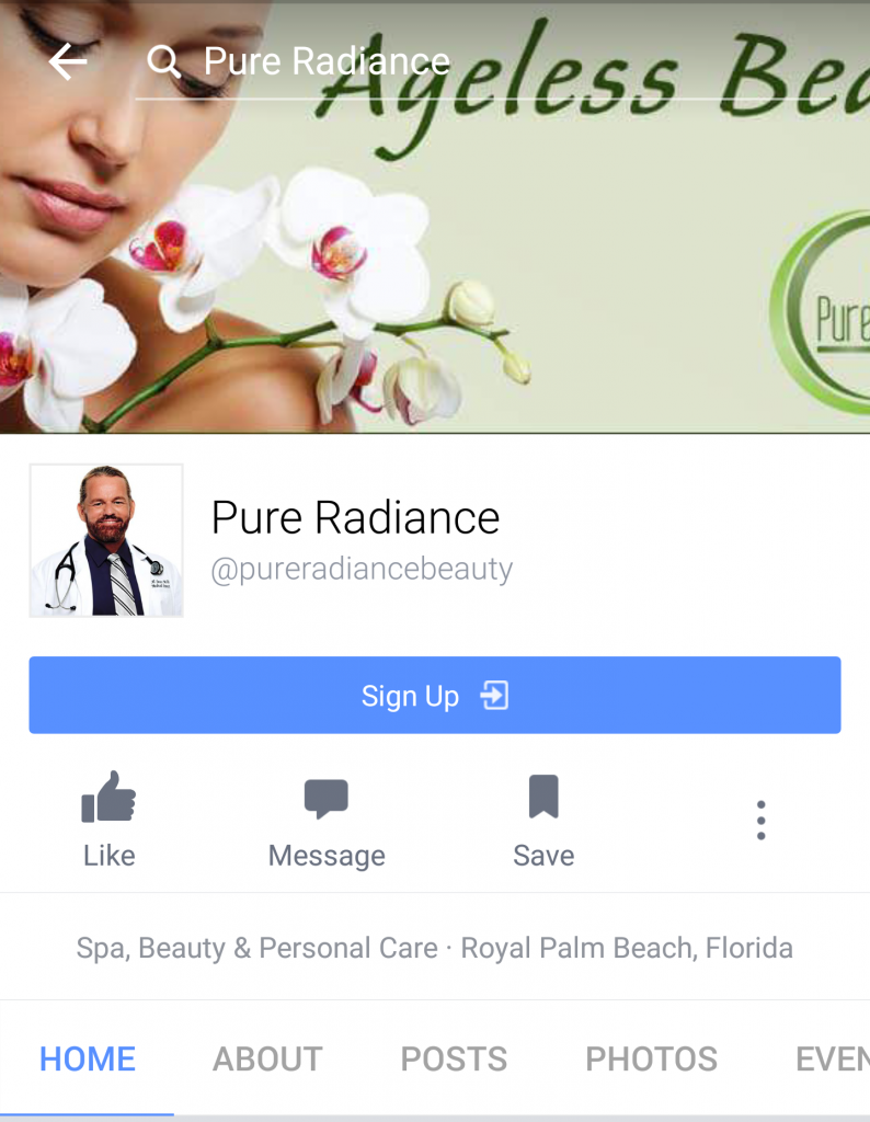
Our core demographic for Pure Radiance is 55 plus. This image on the Pure Radiance Facebook page is not representative of that demographic (in my opinion).
- Make sure your Facebook cover photo size is correct: 828 px wide by 315 px on desktop, 640 px wide by 360 px tall on mobile. If you use a smaller image size, Facebook will stretch it to fit the right size, as long as it’s at least 399 pixels wide and 150 pixels tall.
It be a shame to spend time on the design of a cover photo only to have it look weird when you upload it to Facebook. - Do not put important content on the bottom of your photo. Avoid putting key content or important parts of your image on the bottom of your photo where the name of your Page and Call To Action buttons are. Part of your cover photo is partially hidden on your main Page, therefore, if you place important content in these areas, it will be obscured.
Here’s a trick that will help – draw an imaginary line about halfway up your profile picture, and keep important content (like text or hashtags) above that.
- Right-align the objects in your cover photo. This will add some balance to your cover page – the profile picture is on the right, balance it by adding a focal image on the right.
 We almost got it right here, but we covered up important information by placing them improper areas 🙁
 - Keep mobile users in mind when designing your cover photo.
According to Facebook, over half of its user base (54.2%) access the social network exclusively from mobile devices. On mobile devices, a much larger portion of your cover photo is blocked out because the profile picture and the Page name are on top of the cover photo.
The sides of the photo are cut off on mobile. Smartphones displays only the center 640 pixels wide by 360 pixels tall. If you place important information too far to the right it will get cut off on mobile. You can find additional help here.
Pure Radiance Mobile
- Include a link in your cover photo description that aligns with your page CTA. When people view your cover photo directly, they can access the link.
We have a ‘Sign Up’ call to action button on all out pages, but we did not follow through with a link in the photo description. We left that information blank – wasted opportunity.Here’s a tip – include all necessary information in the cover photo and use items that look like buttons or hyperlinks to encourage interaction. Then, include a link to the related content in the ‘Photo Description’ field.
- Pin a related post right below your Facebook cover image. Pinning a post allows you to highlight a Facebook post on the top of your Timeline.

Pinning a post can emphasize or enforce any call-to-action featured on your cover photo. Remember to unpin once the information is no longer relevant. The event featured above occurred 3 months ago, but it was still pinned to the top of page as of 6/18/2016.
Since writing this article, Facebook made a few changes. You may read about them here.
Over to you…
